

Branding Design – Black Velvet Boudoir
Our client Dale Johnson of Black Velvet Boudoir recently got in contact to help re-brand his boudoir photography. Currently the BVB logo design comprises of a couple of stock elements put together:
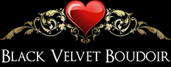 Although he liked the overall look of it there would be issues around Copyrighting the design as is not bespoke. The fleurs in the design are nice and Dale enjoys the love heart although feels that it isn’t necessary to keep it. The first thing we did was ask Dale a series of questions about his business:
A Brief Description about Your Business:
Black Velvet Boudoir is more of a hobby than a mainline business. It offers high quality, luxury photoshoots of boudoir, lingerie and fine art nude subjects.
Ideas: Must not contain any clichés related to photography, this is less about the physical product and more about the experience and value it adds to making someone feel more confident about themselves.
Industry: Luxury Photographic, Lingerie, Boudoir
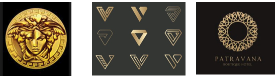
Look And Feel: Think about the Versace logo, it should feel high end and sophisticated. The brand is called black velvet so use inspiration from materials such as velvet, silk and lace. I quite like the use of the heart and the fleurs in the current logo, but don’t necessarily have to stay with this theme.
Preferred Style of Logo: Should be more round in shape as social media has started cropping to round images for profile pictures. It should have a serif based font as this is generally more elegant and fits with the flowing theme of boudoir materials.
Slogan: No slogan.
Inspiration:
Target Audience: Women aged 18-40
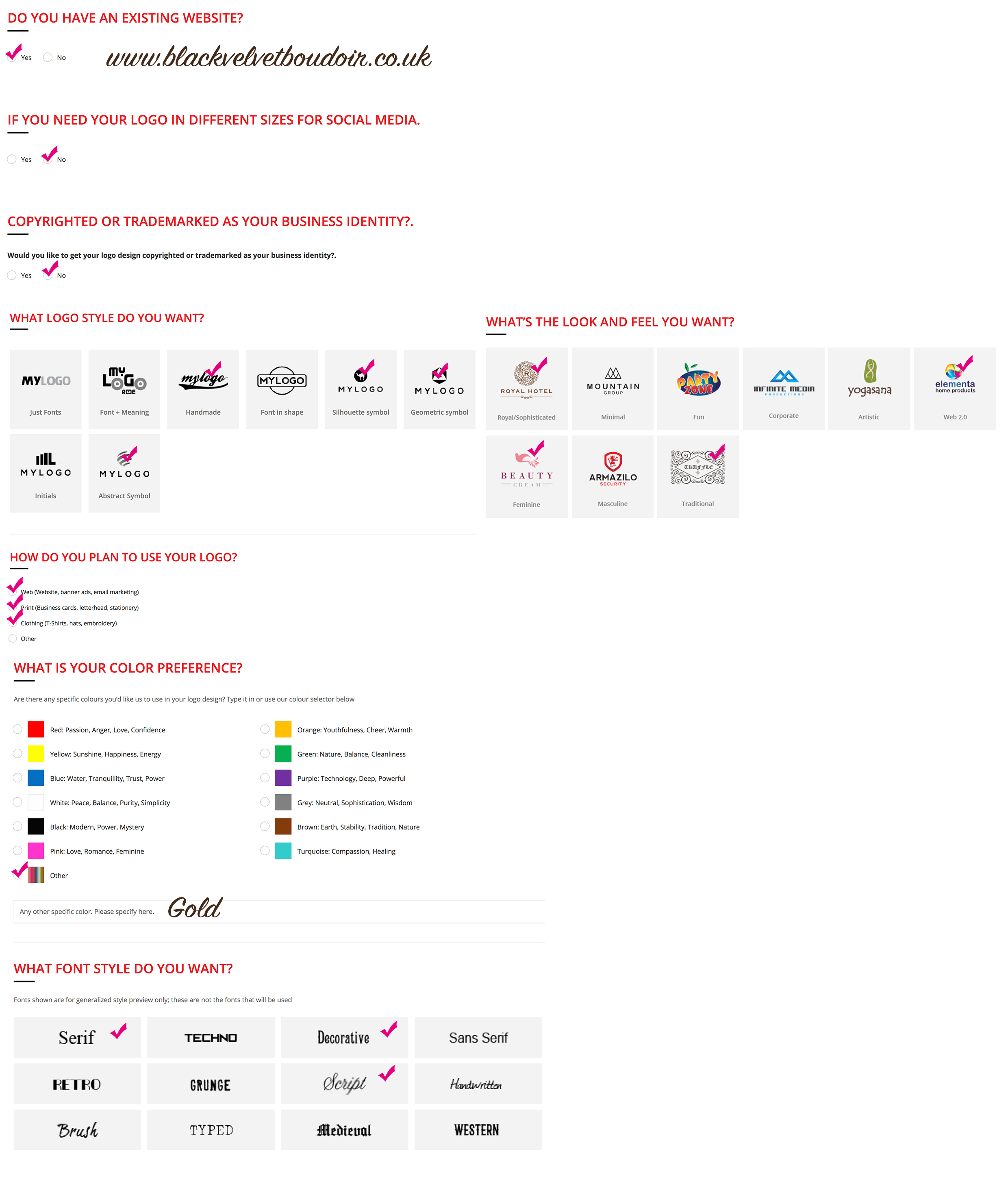
Then to determine the style a bit more we asked Dale to fill out the following form so our designers have something a bit more visual to work with:
Our designers set to work on their initial concepts, we never expect the first set of concepts to become the final design although sometimes this does happen. With so many options checked we developed quite a few initial concepts:
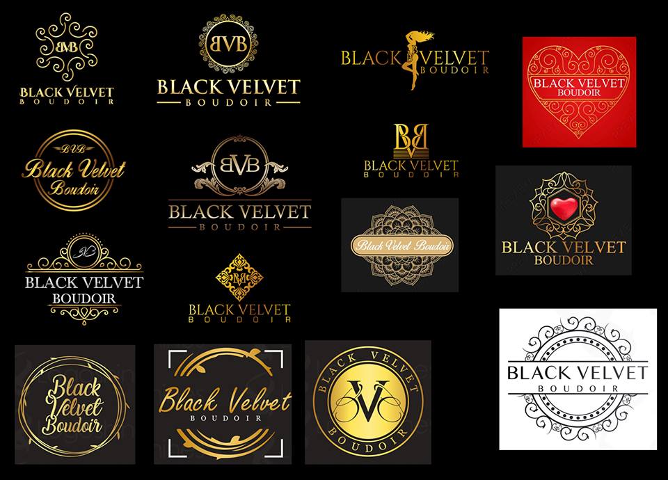
The initial concepts weren’t anywhere near where Dale wanted to be however he was able to narrow it down to 3 which were close to his idea:
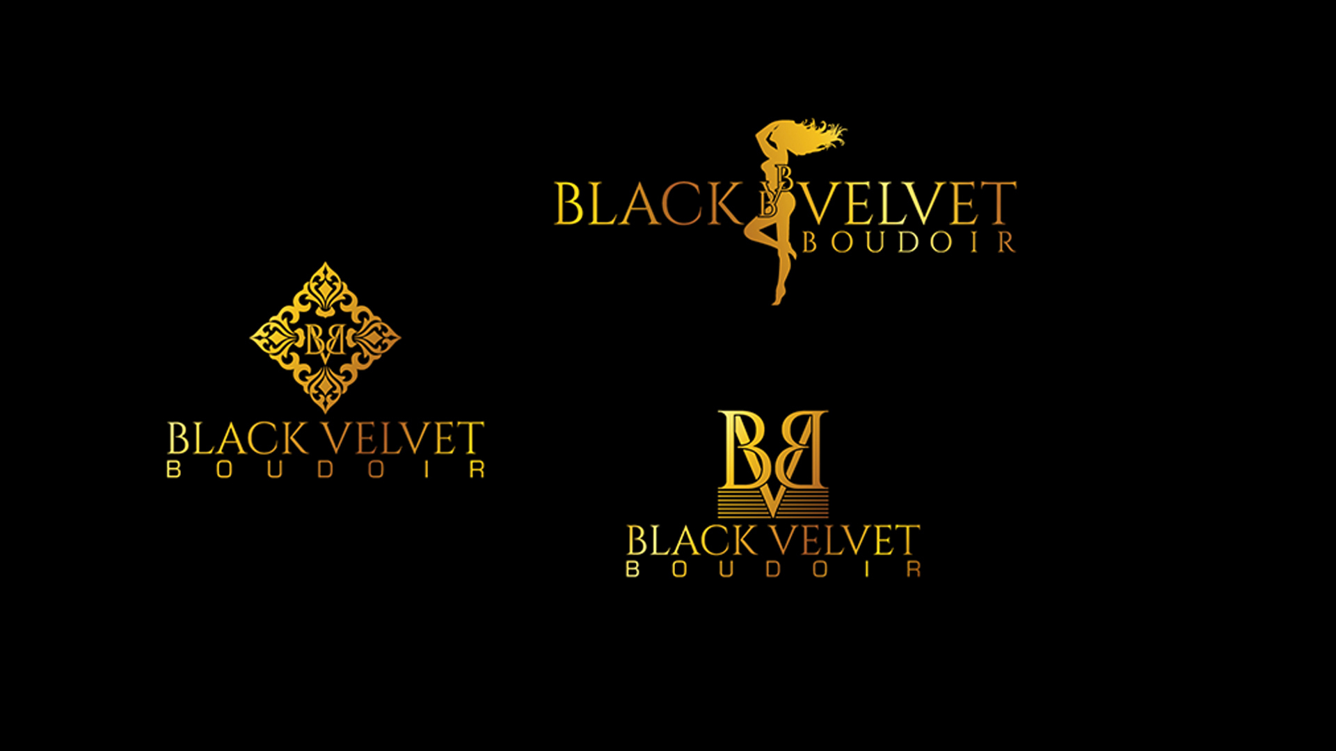
They needed some extra work, the logo with the lady looks a little pregnant or overweight with the BVB written across her so it was suggested that we try re-working a few of these designs without the writing inside.
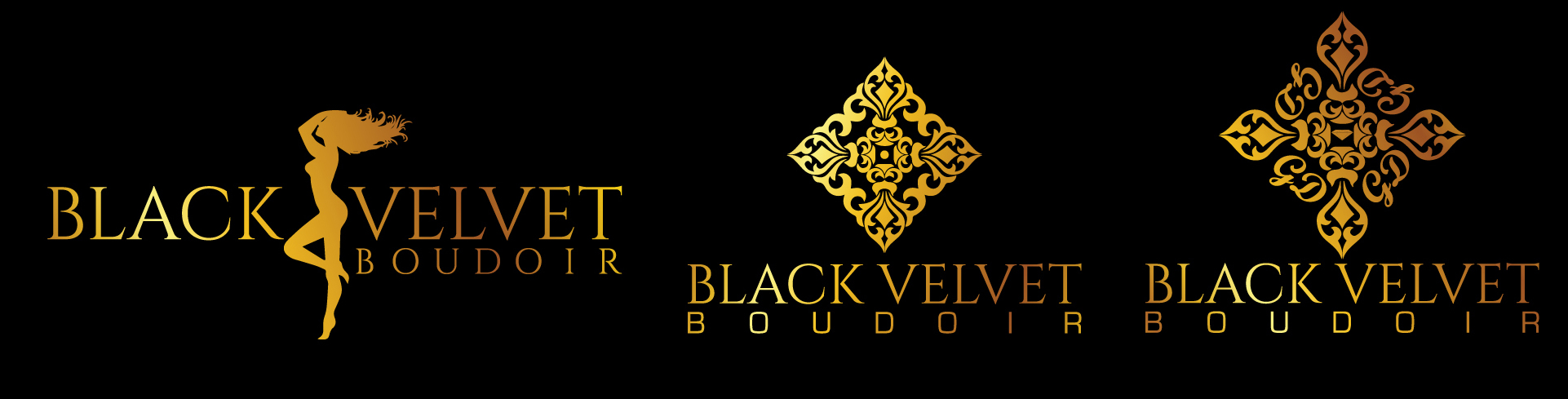
These concepts worked much better, it was decided that actually the logo with the lady wasn’t suitable. Dale then suggested to re-work these a little more and create some which are more circular in design.
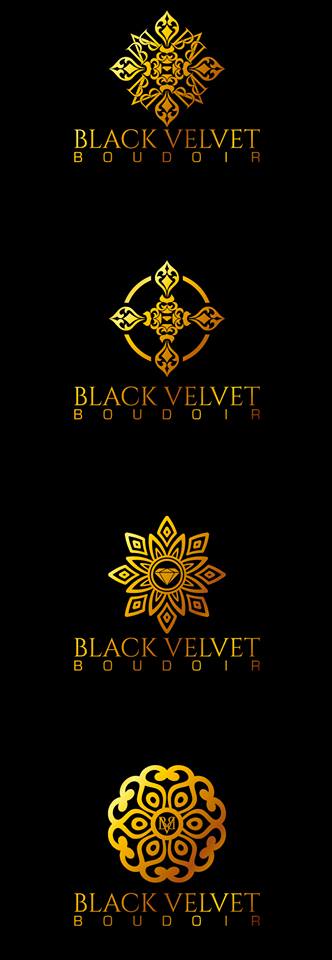
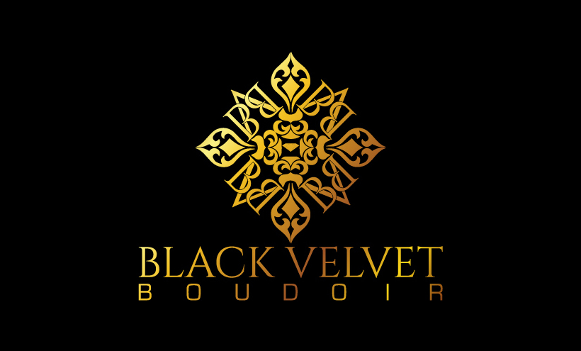
Finally we were there, the first and fourth concept were the main contenders. After doing some research and showing the final 4 concepts to the target audience it was decided that the new design would be number one. The addition of the BVB lettering into the pattern made it more circular and was subtle enough not to be obvious it was in there.
A job done well, well done team and good luck Dale!
