

Holiday Cottages and Villas – Logo Design
Competition Winners
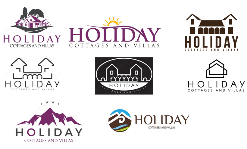
In December we run a competition across Facebook and Instagram to win a free 2D logo design. This could be a design for a new company or the revamp of an existing design. The lucky winners were David and Tracey who run Holiday Cottages and Villas with venues in France and Italy. Their current logo is full of cliches and they were after a more modern design to fit their changing business goals. Their current logo can be seen on the right.


Chosen Concepts
From the selection of concepts we created that can be seen at the top of the page these are the two concepts that they chose to revise. Both concepts are very minimilist, the first concept it was suggested to remove the arches to simplify it more and the second concept they would like to see in the corporate colours. The second concept is not two outlines of a property, infact if you look closely it is one line that continues round to give the illusion of two seperate properties.
First Revisions
The first set of revisions included the removal of the archways and the beginning of combining the 2 purples and grey colour scheme. It was then suggested to bring in a third colour, perhaps a blue, yellow or pink. At this stage one design was ruled out leaving us with only one design to revise.

Second Revisions
The colours used were sampled from an example logo that Tracey provided for us. It was asked if the houses could have two colours applied to them, due to them not actually being two different houses the only way to do this was to try creating a gradient of colour instead.

Third Revisions
Sometimes it is great to just try an idea, even if it isn’t quite what you thought it would be. This allows you to make an informed decision of whether a previous idea was better or not. In this case it was decided that a solid colour would be better for the symbol and the companies original purple for the writing. This then led to our final concepts being created.


Final Design
The final design fulfils the brief, modern and minimalist. In keeping with the company colour scheme and now with an additional colour that can be implemented across the rest of their visual branding. To book your trip to France or Italy take a look at their website www.holidaycottagesandvillas.com
Like this project? Share it using the social share buttons below and leave us a comment.
